Vancouver-based Design Agency
We bring the same thoughtfulness to packaging a story as we do a box of tea. These are just two ways we’ve helped graphic design firm Pendo communicate key initiatives and news for its clients.

We bring the same thoughtfulness to packaging a story as we do a box of tea. These are just two ways we’ve helped graphic design firm Pendo communicate key initiatives and news for its clients.
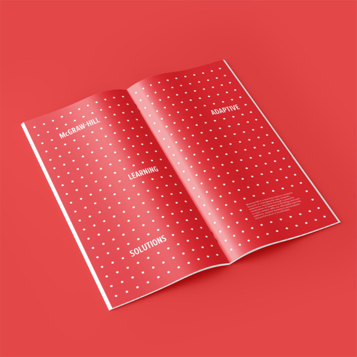
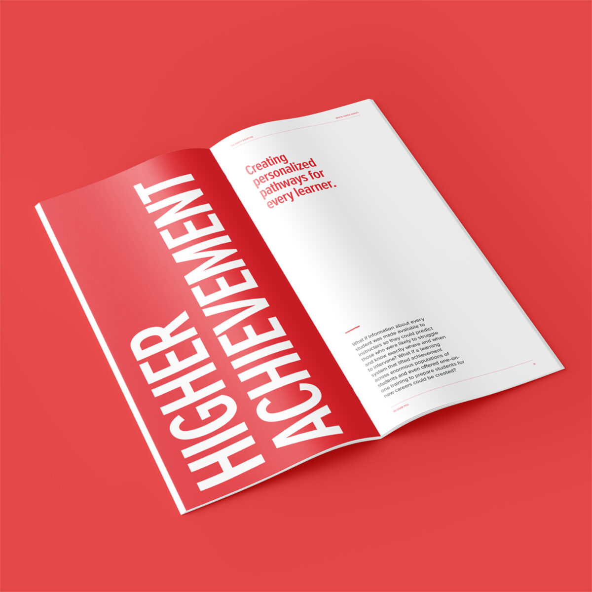
Education leader McGraw Hill was concerned that Hispanic and low-income students and students of colour were graduating from community colleges at a lower rate than their Asian and Caucasian peers. They responded with a new digital learning solution, conveyed in a Whitepaper that we were asked to bring urgency and impact to.
Leveraging McGraw Hill’s red branding was the right choice to embolden this powerful report. We hung the piece on an aspirational theme of “higher”; stark layouts, bold type and emotive student portraits underlined the human impact. The feel throughout was innovative, urgent, empathetic.
Westac is Western Canada’s top resource for insight into transportation issues. The recent pandemic highlighted the global supply chain’s importance like never before, and Westac needed to delivered a lot of numbers and perspectives that the industry was waiting for.
A novel strategy for ensuring reader engagement throughout Westac’s sizeable report was to make each spread design unique, keeping the experience fresh. The organization’s three brand colours gave us a natural solution for differentiating chapters: information was delivered in crisp, bite-sized pieces and large, compelling typographic elements. The overall look felt current, and Westac looked like the authority it is.


